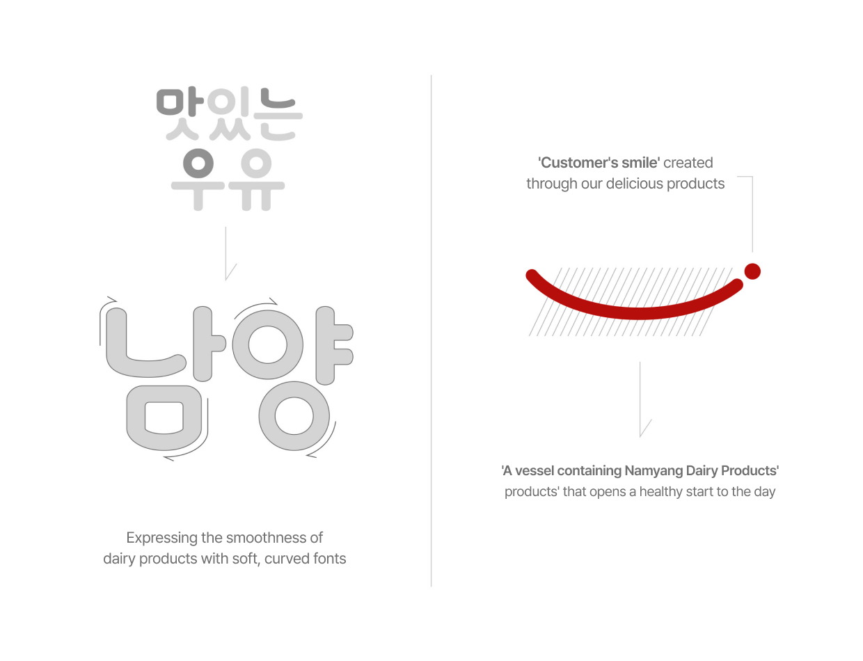
Namyang Dairy Products' new corporate identity (CI) is the result of careful consideration on how to effectively incorporate and embody the company's direction and values, "Healthy Beginning," into the CI.
Therefore, we derived the CI design from 'Delicious Milk GT', which opens a healthy start to the day and is the representative brand most familiarly recognized by customers. We created the prototype of the New CI utilizing soft curved fonts and a smile-shaped mouth.
An animation depicting customers smiling while pleasantly embracing Namyang's representative product, 'Delicious Milk GT'
Brand Color
Brand CI Colors
The red of the symbol, which is the primary color, is named Healthy Red, meaning 'health', and the deep gray, expressing the Healthy Beginning Namyang text, is represented as Start Deep Gray, symbolizing 'beginning'.
'Milk', Namyang's representative product, is used as Milk Beige.